WhatsApp • Concept • 2026
Bringing reminders to WhatsApp

Role
Product Designer
Timeline
1 week
Skills
Product design
UX research
UI design
View mockups
Overview
Designing for the reply you meant to send on WhatsApp
WhatsApp is where billions of conversations happen, and plenty of them end with "I'll reply later."

User gets a text thinks “I’ll reply later”

Later never comes. New chats bury the old one.
Problem
WhatsApp has no way to help users act on an intention to reply later.
The issue isn't simply forgetting. Users already know they want to reply. The problem is that once the chat gets buried, WhatsApp gives them no active way to follow through.
Why "Mark as Unread" doesn't fix it.
I considered using WhatsApp's existing "Mark as Unread" behaviour, but it only preserves the user's intention passively.
3 of 8 participants used it, but only 2 found it effective. New messages can quickly bury the unread chat, meaning the user still has to remember to return to it.
Decision: The reminder needed to do more than signal "come back." It needed to actively bring the conversation back into the user's attention.
Opportunity
How might we help people follow through on "I'll reply later" without relying on memory or hoping they notice the chat again?
Solution
Reminder that helps users act on their intention
A reminder scheduled directly from a chat. When it triggers, WhatsApp notifies the user and moves the conversation back to the top of the inbox.
Instead of asking users to remember to return to a chat, I designed a reminder that brings the conversation back to them when they choose.

Lock screen notifies users with the contact name and reminder label.

Chat resurfaces to the top of the inbox when reminder is triggered with a ringing clock icon to mark the reminder chat.
Design process
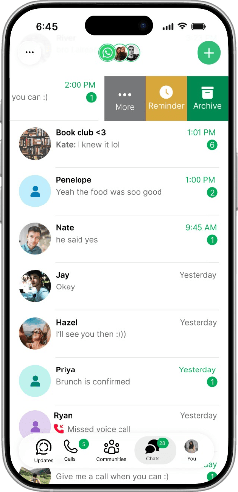
Swipe, not long-press
WhatsApp already has two ways to act on a chat: long-press opens a full menu; swipe reveals quick actions without opening the chat.
I considered: Long-press
Problem: It can accidentally open the conversation and mark the message as read.
Decision: Use swipe as the primary path.
Why: Allows users to set a reminder without opening the chat.
WhatsApp already uses swipe for quick chat actions, so the interaction also fits an existing behaviour rather than introducing a new gesture.
Reminder is also available through the long-press menu as a secondary path.
Setting the reminder should take less time than texting back.
I didn't want this to feel like leaving the chat list to do a separate task, so I used a modal bottom sheet instead of a full-screen flow. Rather than invent a new visual style (which I did in the medium fidelity), I followed WhatsApp's own goal of feeling native to the device it's on, and leaned on iOS's actual system components to keep the experience completely familiar.
Goal: Setting a reminder should feel lighter than leaving the conversation to do a separate task.
Decision: I used a modal bottom sheet instead of a full-screen flow.
Why: Users can set the reminder without feeling like they've left the chat experience.
For the custom date and time, I used the device’s native date and time picker instead of creating a new interaction. Android users would get the Android-native picker, while this concept uses Apple’s picker because I designed the example for iOS.


Why I didn't auto-cancel on reply.
My first assumption was wrong.
I initially planned to automatically cancel a reminder when the user replied. It seemed logical: if they've replied, they no longer need the reminder.
But that breaks in a simple scenario: a user could set a reminder to wish someone happy birthday while still chatting with that person about something else.
Decision: The reminder clears only when the user cancels it or it fires.
Beyond just replying: this feature can also be used to set reminders for any future event, like telling a friend to book the tickets before they sell out.
Once set, the chat row shows a small clock icon next to the note, so an active reminder is visible at a glance in the inbox. Tapping the reminder button again reopens the same sheet, pre-filled, with a red "Cancel reminder" button at the bottom.

What if the reminder gets missed?
Design question: What happens when the notification itself isn't enough? What if the user misses their reminder notification or accidentally swipes it away??
I didn't want the reminder's usefulness to depend entirely on the lock-screen notification.
A banner sits inside the chat after the reminder triggers: "Reminder sent Sept 2, 2026 at 11:00 AM. Note: Ask to call tomorrow at 3:00 PM." or "Send a message" if no note was attached. It stays until dismissed.

If I had more time: testing the feature at scale
Run the survey with 50+ users, to see if the 75%/87% numbers hold up.
Usability test the clickable prototype with people who don't know the project, watching where they hesitate or misinterpret the swipe action.
A/B test swipe vs. long-press in the prototype itself, show both to different users and see which one people find faster or more intuitive.
Whether the "back to top" behaviour feels helpful or intrusive. Bumping a chat to the top when a reminder triggers could read as the app is helping me follow through, or it could feel like an old conversation is interrupting current ones, a tone I can't guess at without watching real reactions.
Reflection
Small annoyances are worth investigating because they can reveal a larger product gap.
This started as something too minor to call a problem. Looking closer showed that everyday frustrations can reveal meaningful opportunities for better experiences.
Familiar isn’t always the way to go
Long-press felt like the obvious choice, it's what people already know. But it could accidentally open the chat, revealing to the other person that the user had already seen their message. Swipe solved this without that risk even though it is not as familiar.